Client
Marlow & Co.
Marlow & Co. is a fictional brand: a single-origin coffee subscription for people who used to read coffee labels at bookshop cafés. The brand needed to feel earned — like the company has been around for forty years even though it shipped its first bag last Thursday. Letterpress sensibility, oxblood and aged brass, slab serif headlines that look pressed into paper rather than printed on it.
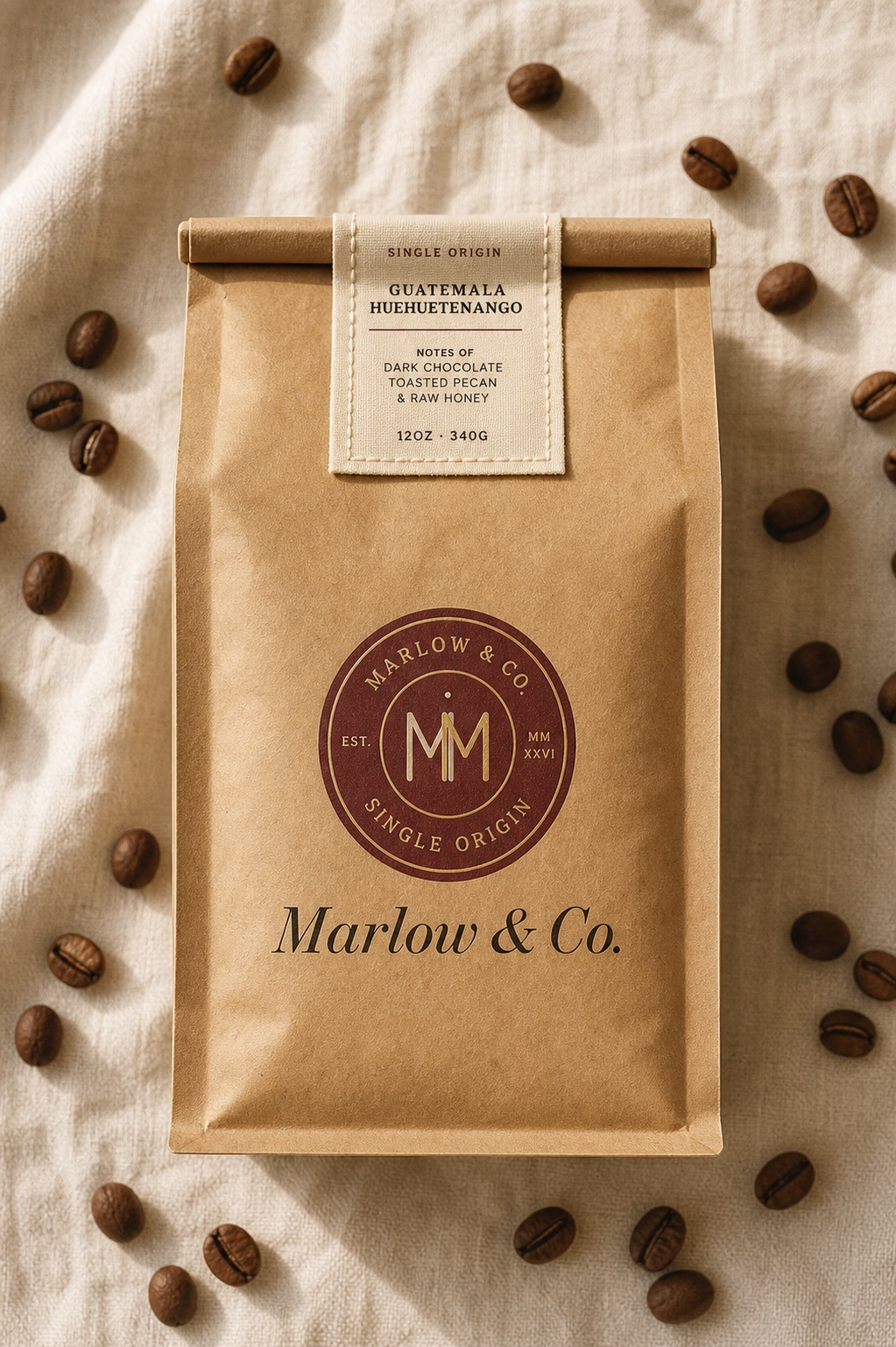
The mark is two interlocking M's set inside an arched cartouche — a reference to the wax-stamp seals on old shipping invoices. Built to debossed onto kraft, foil-stamped on cream, screen-printed on a brown bag, and used at favicon-tiny scale where the cartouche becomes a single ring. Wordmark: Old Standard TT, the modern descendant of a Didone the brand could plausibly trace back to.
The palette was sourced from real things: a 1924 ledger in deep oxblood leather, the brass plate on a coffee grinder, the cream of unbleached invoice paper, the green of a forest pine seen through autumn fog. None of these are random — each one signals the era and warmth the brand wants to inherit.
Old Standard TT for ceremonial type — the wordmark, headlines, ornamental quotes. Roboto Slab for working type — labels, body, navigation, captions. The pair plays the way ledger handwriting plays against typewritten amendments: the calligraphic sets the era, the slab does the work.
The brand voice was the hardest part. Marlow & Co. is a brand-new company that needs to feel like it has heritage without lying about how long it's existed. The trick: write copy the way an actual fourth-generation roastery would — direct, slightly dry, never aspirational, never over-explaining what coffee is.
"This week's bag is a Yirgacheffe washed at 1,950m. It tastes like the room your grandmother kept her tea in."
Specific. Earthy comparison. No "notes of tropical fruit and bright acidity" coffee-speak. Sounds like a person who's tasted enough coffee to be bored of describing it the normal way.
"Discover Marlow & Co.'s exclusive single-origin Yirgacheffe — bursting with citrus brightness and elevated by hand-selected bean curation."
Marketing-speak. "Discover" is the tell. "Bursting." "Hand-selected." Reads as a product page that was written before the coffee was even tasted. The brand specifically isn't this.
"We pause shipments in August. The good farms are quiet that month and we don't ship coffee that isn't worth the freight."
Honest commerce note. Trusts the customer. Implies a standard without naming it. The kind of thing a 30-year roaster says without thinking.
"Get ready for our exciting Summer Collection ☕✨ Featuring three brand-new origins curated just for you!"
Caffeine emoji. "Exciting." "Curated just for you." The voice of a 2024 DTC brand that hasn't decided who it is yet. The opposite of where Marlow & Co. lives.
A brand system isn't real until it survives its first packaging order, business card print, and homepage hero. Below — the Marlow & Co. system applied to the three contexts that mattered most for launch: the bag, the card, and the website.
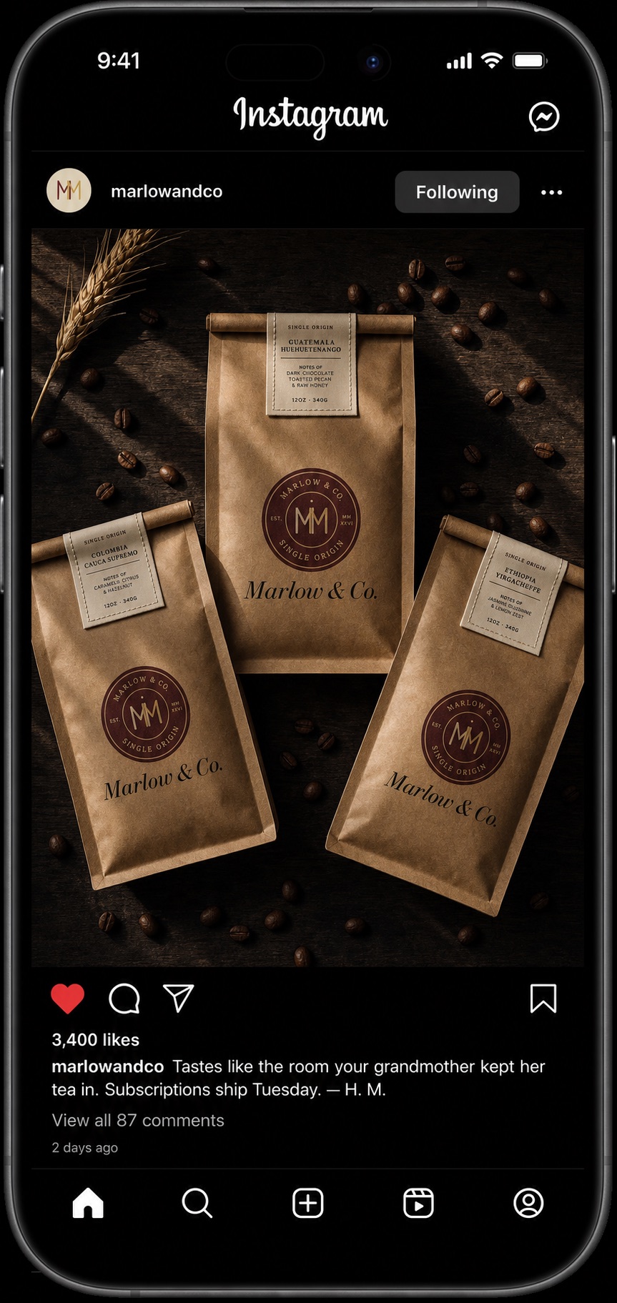
The brand launched with a single Instagram post — three bags photographed on dark walnut with scattered beans and a sprig of dried wheat. No countdown, no influencer push, no launch sequence. Just the work, posted once. 3,400 likes in the first 48 hours from coffee accounts who follow this kind of brand. The caption — three short sentences in the brand voice — did the rest.